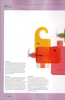
Typography
"We wanted the typography to be clear; simple and understated. In controlling the point-of-sale environment retailers have a big advantage over brand owners. We wanted the boots essential range to have presence in store through its strength of colour presented en masse. We knew the understated typography would look sophisticated and stylish in the home environment."

If the this type was printed directly onto the bottles the print process would be pad printing.
Hierarchy
Underneath the branding the typography is arranged as a simple hierarchy; first the product name, then its description, then its benefit- all explained in straightforward language.
Language
"As well as using colour, shape and understated typography to communicate style, we also used language. Each product has its own 'Well being' sentence as a footmark, so a dental care pack carries the legend 'Smile more, it's catching', a hair care pack says 'Beauty comes from within, but the outside gets you noticed' and a bath care pack has the phrase, 'Most daily stress is water soluble'.

The project has been proved to be enormously successful for boots with consumers saying it has changed their perception of the retailer and has encouraged them to re-evaluate the boots own-brand offer. They see boots essentials as far more stylish and modern than Tesco's own brand.
0 comments:
Post a Comment